The Washington Post
Making the news more digestible, less overwhelming and easier to access for a new generation of news readers.
ROLE Sole UX designer/researcher
TIMEFRAME 3 weeks
TOOLS Figma, FigJam, Zoom
CONTEXT Student project for UCLA Extension certificate program
UX RESEARCH | UX DESIGN
The problem
The Washington Post is a renowned American daily newspaper with a rich history dating back to its founding in 1877. In recent years, The Post has successfully transitioned into a successful national digital media company. However, in today's rapidly evolving digital landscape, it has a crucial need to stay up-to-date with the up-and-coming generation of readers.
For young Washington Post readers, they need an easily digestible way to consume the news that interests them because they want to stay informed but are overloaded with content.
So, how might we help young readers of The Washington Post to stay informed and engaged with news topics that interest them, without feeling overwhelmed?
The solution
For subscribers
Unlimited categories
of interestUnlimited stories
Access to full stories
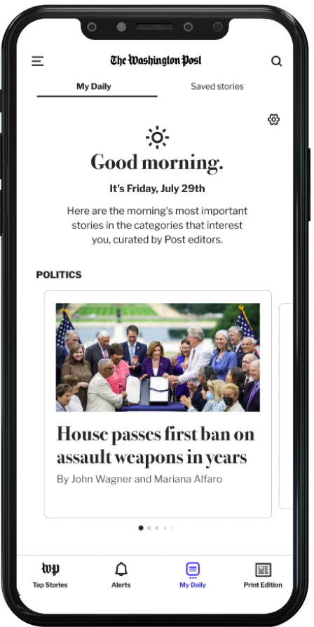
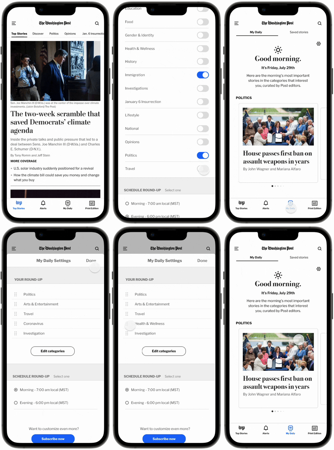
A personalized, curated “My Daily” feed for both subscribers and non-subscribers that offers a daily digest of short-form news stories.
My Daily
For non-subscribers
Up to 5 categories
of interestTop 5 stories of the day in chosen categories
Defining the problem
User interviews
To gain insights into users' motivations, pain points, habits, and needs, I conducted semi-structured user interviews via Zoom with four young adult participants who engage with news content. My questions focused on participants' news consumption habits, preferences, and routines. Specifically, I asked about where they typically discover news, the platforms they use, the extent to which they read/watch/listen to a story, and which news outlets they trust the most and why.
Affinity mapping
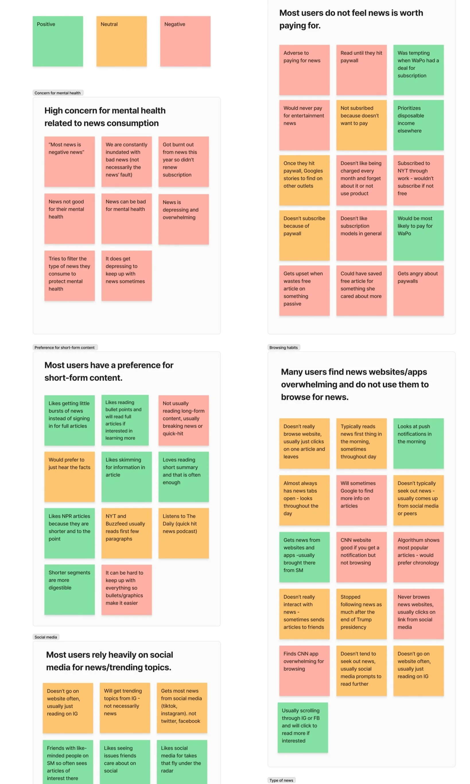
Based on my user interviews, I analyzed the insights gathered and categorized them into positive (green), neutral (orange), and negative (red) in order to gain a clear overview of the pain points and areas of improvement. I then organized these insights into an affinity map, allowing me to visually identify patterns and themes.
Key insights from user research
High concern for mental health as is relates to news consumption
High preference for short-form content
Users find news websites/apps to be overwhelming and rarely browse them.
Young users do not see value in paying for news subscriptions.
Synthesize & analyze findings
User persona
Based on the insights gathered from my research, I developed a primary persona that focuses on their goals and frustrations related to news consumption as a young adult.
Isabella, 23
Isabella is a recent college grad who is working as an intern. She feels very passionate about current events and social justice and tries to keep up with national/world news as much as she can.
She follows a few news outlets on social media but she is typically informed of news from her friends sharing graphics or articles on social media as well as phone notifications. She doesn’t often read full articles as she loses interest after the first few paragraphs.
-
Wants to stay informed on national and world issues
Needs quick ways to digest news
Wants to make sure she is getting the most accurate news
-
Finds it difficult to navigate all of the different news outlets
Thinks news websites are overwhelming and confusing
Doesn’t have the time or attention span to read/watch/listen to long-form news content
Is concerned about the effect the news has on her mental health
Brainstorming & ideation
Solution sketching
I explored various ideas with some rough sketches, focusing on delivering short-form news content and providing a daily digest for readers. I also explored delivering a news summary at specific times of the day to encourage users to read news only during those periods, with the intention of protecting mental health.
I moved forward with a potential solution that combines the strongest aspects of each idea. The proposed solution is to create a curated "My Daily" feed that is sent to users via push notifications, either in the morning, evening, or at specific scheduled times for subscribers. This feed, available directly in the app, will feature flip-through cards highlighting the top stories of the day in each user-selected category. Free account users will be able to choose up to five categories and receive the top five stories, while subscribers will have unlimited options for categories and stories. Each set of cards will conclude with a call-to-action, inviting users to read the full story, which will be exclusive to subscribers.
User flow
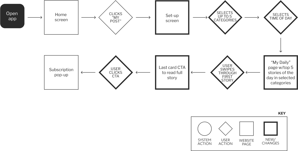
Next, I created user flows for the two main tasks related to this new feature that I wanted my persona to be able to complete.
The first task is for the user to set up their own personal, free "My Daily" round-up. They can do this by selecting the categories they are most interested in and choosing the time of day they want to receive the notifications. In this flow, I also included some call-to-actions (CTAs) to encourage the user to subscribe.
The second task is for the user to customize their "My Daily" round-up with all of the additional features available to subscribers.
Task 1: Isabella signed up for a free account on the WP app and now she would like to set up a daily personal news summary.
Task 2: Isabella has decided to subscribe to WP. She wants to further customize her “My Daily” summary.
Mid-fidelity wireframes
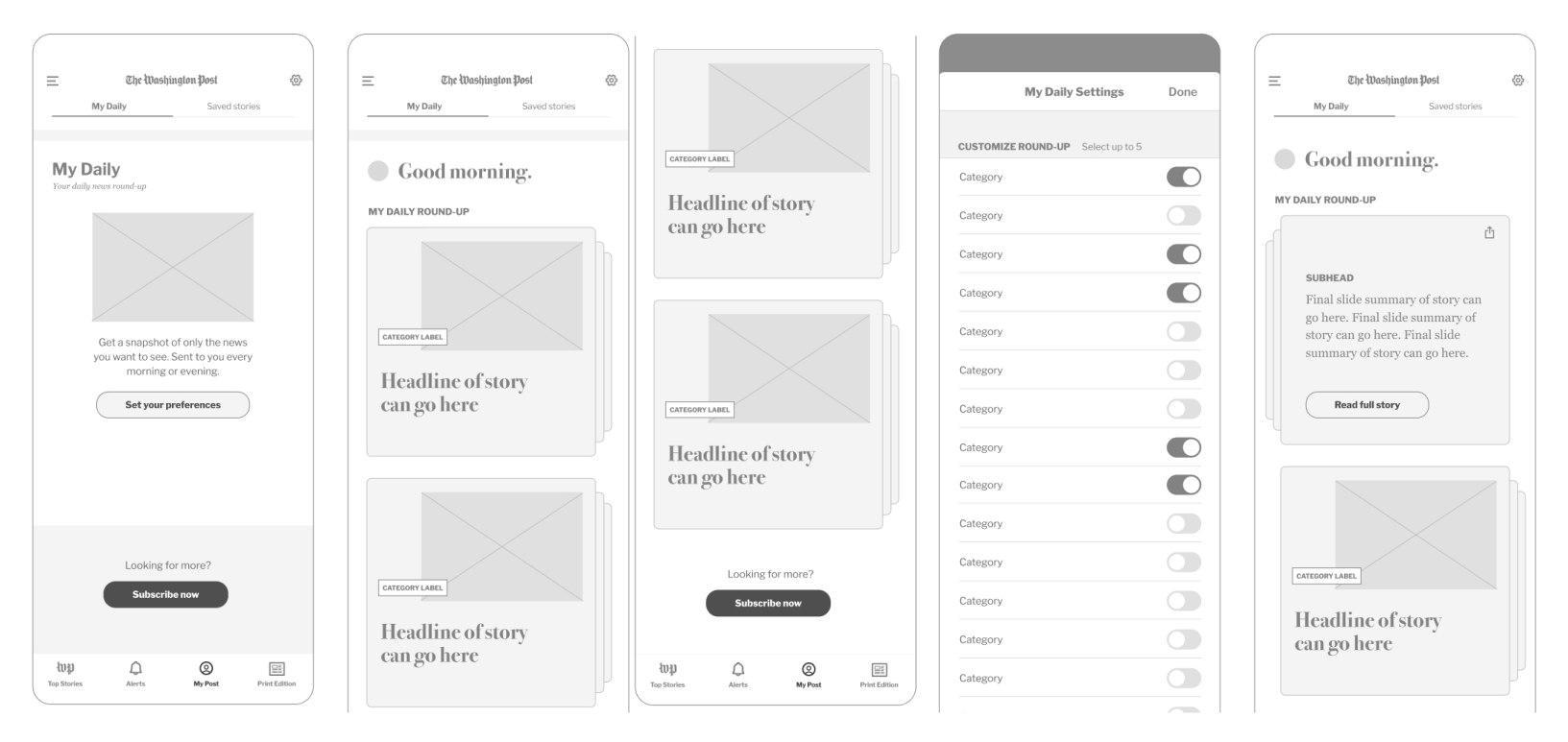
I created mid-fidelity wireframes of each screen required to complete the user's tasks. This step allowed me to gain a deeper understanding of the layout and available options before beginning the prototyping phase.
Prototyping, testing & iterating
High fidelity prototype
After exploring those user flows, I determined that focusing on both the subscriber and non-subscriber flows would be beyond the scope of this challenge so I decided to first focus on the non-subscriber experience.
I created an interactive prototype in order to test the usability of the My Daily feature.
Using the prototype, the user should be able to:
Set preferences for My Daily feed
Edit/customize My Daily preferences
Swipe through story summaries in feed
User testing
I conducted a moderated remote and in-person usability test with 4 users and asked them to complete two main tasks:
Set their preferences as a new My Daily user.
Browse the My Daily page and to change preferences as an existing My Daily user.
PAIN POINTS
Testers did not have a clear understanding of the benefit of becoming a subscriber.
Testers did not have a clear understanding of the differences between being a subscriber or a non-subscribers
Main insights from user testing
GAIN POINTS
Testers said that overall the My Daily feature was easy to use
Testers did find value in reading short summaries of stories daily.
Iteration
Based on the feedback received from user testing, I iterated to address the identified pain points:
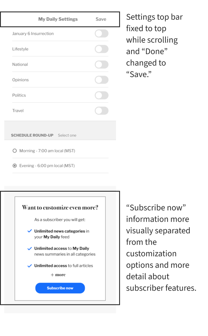
On the preferences screen, I visually separated the “subscribe now” information from the preferences and I added some bullet points of the main benefits of subscribing
I also changed the “done” button to “save” and I change the top bar to be fixed to to top as the user scrolls through their settings options.
I also added a pop-up confirming that the users’ changes were saved after pressing “save.”
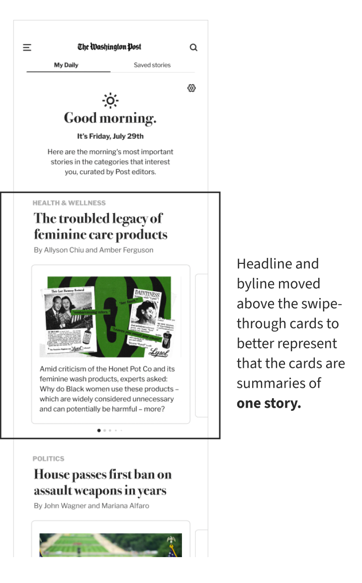
Lastly, I changed the layout of the story cards so the headline and byline are above the cards in order to better represent that the summary is of one story.
“I love the short news summaries - it makes me feel like I am getting only the most important parts of the story.”
— User tester
Final thoughts
Given the fictional and educational nature of this project, this is where the process ended. However, if there were additional time and resources available, my recommended next steps would be to:
Test iterations
Continue to test iterations of non-subscriber feed.
Design & test subscriber feed
Develop subscriber feed and subscriber customization options
Additional interviews
Conduct additional interviews to determine what features would provide further value for subscribers.
