Dollar Shave Club
Exploring opportunities in the shaving product subscription industry that Dollar Shave Club pioneered.
ROLE Sole UX designer/researcher
TIMEFRAME 3 weeks
TOOLS Figma, FigJam, Zoom
CONTEXT Student project for UCLA Extension certificate program
UX RESEARCH | UX DESIGN
The problem
Dollar Shave Club is a pioneer in the online subscription service industry. However, their year-over-year subscriber growth has slowed since Unilever acquired the brand in 2016. In general, the subscription industry has seen a decline in subscriber retention with nearly 40% of subscribers canceling, according to a study from McKinsey and Co.
In my research, I discovered that Dollar Shave Club customers need a better way to manage their subscription because they are acquiring a backlog of products and paying for products they don't need.
So, how might we enhance the subscription experience for Dollar Shave Club customers?
The solution
My proposed solution is to improve the existing subscription experience by offering additional options for users to customize their experience.
Change quantity and frequency of delivery for individual items.
Option to require approval before user is billed & items shipped.
Defining the problem
Competitive analysis
I conducted a competitive analysis to provide a comprehensive comparison between DSC and its competitors. Some notable takeaways from this research:
There was a lack of options for subscription customization amongst almost all brands.
DSC had a section for customer reviews on their website, but no reviews are visible. Some other competitors did have reviews on their websites.
DSC had the most straightforward starter quiz.
Almost all brands offer some kind of new member deal.
No direct competitors had apps and DSC used to have an app but discontinued it in 2021.
User interviews
In order to uncover users’ motivations, pain points, habits and needs, I conducted semi-structured user interviews on Zoom with 5 users who use online subscription services in general and are either present or past subscribers of DSC.
The key objective of this research was to discover:
Users’ relationship and experiences with subscription services
Users’ personal experience with DSC and what they liked and disliked about their experience
Users’ shaving habits, such as what method they use, what razor they use, how often they change their razor, etc.
Reasons for subscription cancelations and factors influencing subscriber retention
Affinity mapping
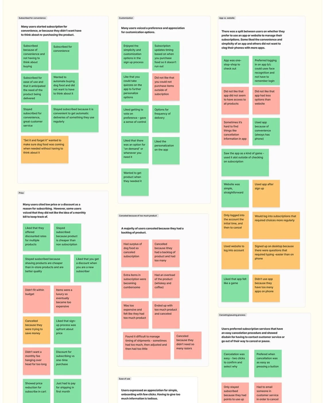
In order to analyze my finding from the user research, I gathered the insights and organized them into an affinity map. This allowed me to gain an understanding of the pain points and areas that needed improvement. By categorizing the insights as positive (green), neutral (orange), and negative (red), I was able to identify patterns and themes visually.
Key insights from user research
A majority of users canceled services because they acquired too much product.
Many said that they found subscriptions to be convenient.
Don’t want to go out of their way to cancel or pause.
Subscriptions are usually cheaper than buying outright.
Don’t love having another monthly fee to be surprised by.
Many users voiced a preference and appreciation for customization options.
Synthesize & analyze findings
User personas
Based on the insights from my user research, I developed personas with specific goals and frustrations in mind. These include people using subscription services for the price, users appreciating the convenience of subscriptions, users not wanting to keep track of another monthly fee, and users ending up with too much product.
Frugal Frederick
Frederick is a bargain hunter who enjoys saving money. He prefers to keep his grooming routine simple and doesn't want to spend too much time on it. While he likes using high-quality products, he doesn't want to break the bank to afford them.
He likes the subscription model for purchasing his grooming products because of its convenience.
-
Always wants to find the best deal
Needs a convenient way to buy razors
Doesn’t want to put too much thought into his razor purchase
-
Doesn’t like having a monthly fee hanging over his head
Can’t quite get the timing of his subscription right
Forgets to cancel or pause his shipments when he doesn’t need product
Ends up with too many replacement heads
Busy Bella
Bella is an entrepreneur who enjoys trying new things. She enjoys experimenting with different subscription boxes for things like fashion, beauty and self care.
She is very often on-the-go and uses her phone for everything. Because she is so busy, she likes to use products that make her life easier, not harder.
-
Wants to try the latest and greatest products
Needs a quality razor
Wants to be able to manage her subscriptions on the go
-
Is subscribed to too many products finds them hard to manage
Usually surprised when a subscription order arrives
Feels like cycling through razors is wasteful
Finds that her razor gets dull
Doesn’t like having to log onto a website and remember her login info every time she wants to manage her subscription
User journey
I developed a user journey map for my primary persona, Frederick to gain a deeper understanding of his experience with subscribing to DSC, receiving products, and renewing the subscription. This exercise was helpful in identifying specific pain points and uncovering opportunities within those pain points.
Brainstorming & ideation
Solution sketching
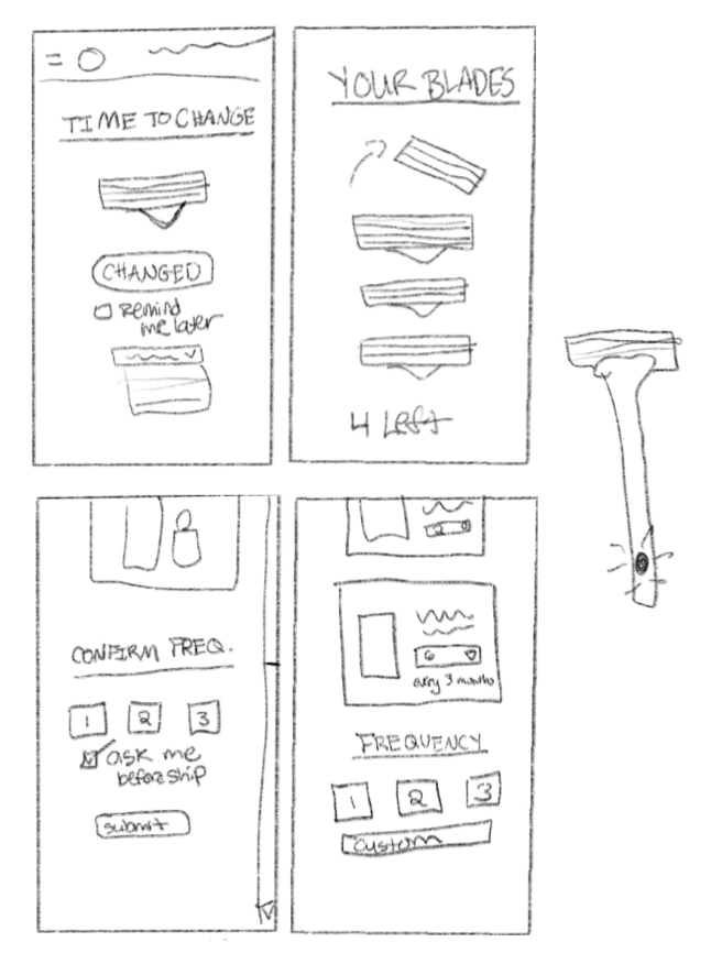
Using all of the information I gathered, I started brainstorming first by solution sketching. I sketched out a few different ideas that could improve the subscription and renewal experience on the existing DSC website.
My first idea was to set up a reminder system for the user to change their blade. This would address the issue of people not changing their blade frequently enough, resulting in excessive product accumulation.
My second idea was to add an option to turn on approval for billing and shipping. This would allow users to make changes to their subscription quantities or reschedule their next shipment before being billed. The goal is to prevent frustration and retain customers by reducing the frequency of charges and maintaining long-term subscriptions.
My next idea was to offer more frequency options in the sign-up and subscription management process. This idea would allow users to set different frequencies for different items and also have more options for timing.
My last idea was to introduce a razor technology that has a reminder light for when the blade needs to be changed and also is able to sense when the blade gets changed by the user.
Prioritization matrix
After I sketched out my ideas, I used a matrix to determine the effort vs. impact of each idea.
After analyzing the matrix, I determined that a combination of idea 2 and 3, which includes implementing billing approval and providing more frequency/customization options, was the most suitable solution for this project, taking into consideration the scope of the project and the potential impact on addressing the users' needs.
User flow
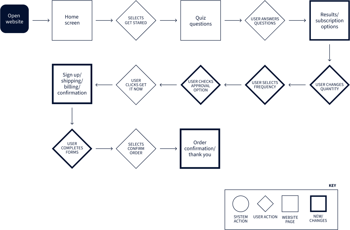
Next, I decided to create a user flow to better flesh out my ideas and think about how they will be incorporated into the user’s journey. This also helped me to figure out which existing pages would need changes and how many additional pages would need to be created in the prototype
Situation 1: Frederick wants to start his subscription to Dollar Shave Club but wants to make sure he has control over when he is billed.
Situation 2: It is time for Frederick’s 2-month subscription renewal but he still have enough product. He wants to push the shipment off another 2 months
Low-fidelity wireframes
Using the user flow, I created low-fi wireframes to visualize the changes I wanted to make to existing pages and to plan the layout of additional pages.
Prototyping, testing & iterating
High fidelity prototype
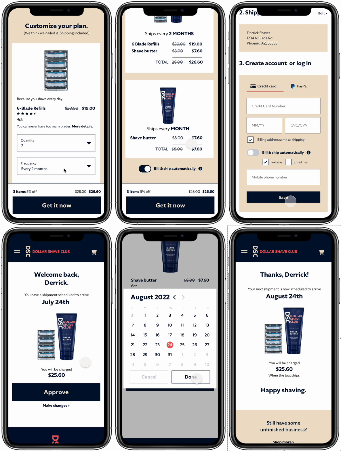
I created an interactive prototype in Figma in order to test the usability of both flows.
Using the prototype, the user should be able to:
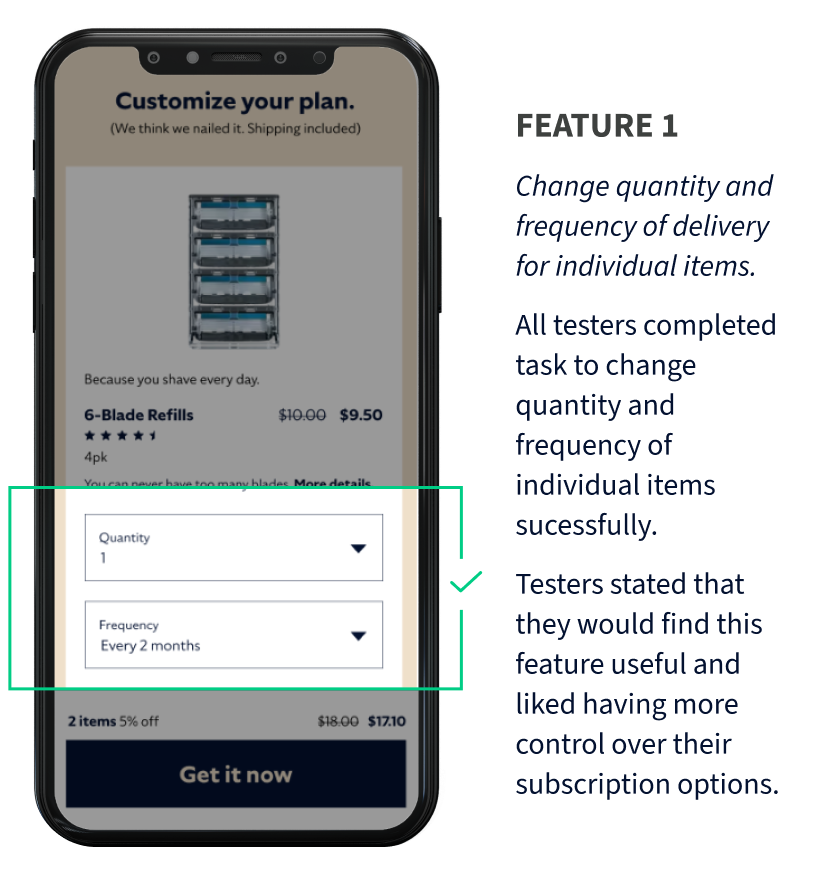
Change quantity & frequency of individual items
Toggle auto bill & ship on/off
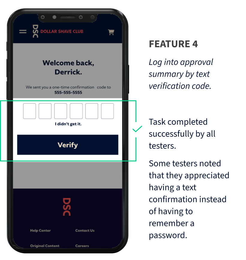
Choose email or text notification preference when autoship is off.
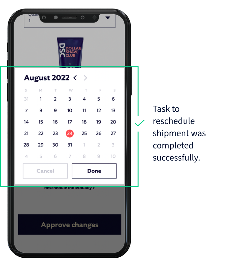
Reschedule shipment
User testing
I conducted a moderated remote and in-person usability test with 5 users and asked them to complete several tasks related to the usability of the new features. The main tasks were:
Task 1: You only need 1 pack of blades every 2 months and you want to get 1 shaving butter once a month. You also want to ensure you receive a text message each month to approve shipments before you are billed. Show how you would sign up for a subscription based on these requirements.
Task 2: You received a text with a link to approve your next shipment. You click on the link and are brought to this page. You want to delay your shipment until August 24th. Show how you would accomplish this.
After the participants completed each task, I asked several follow-up questions in order to understand their feelings and motivations around the process.
Main insights from user testing
PAIN POINTS
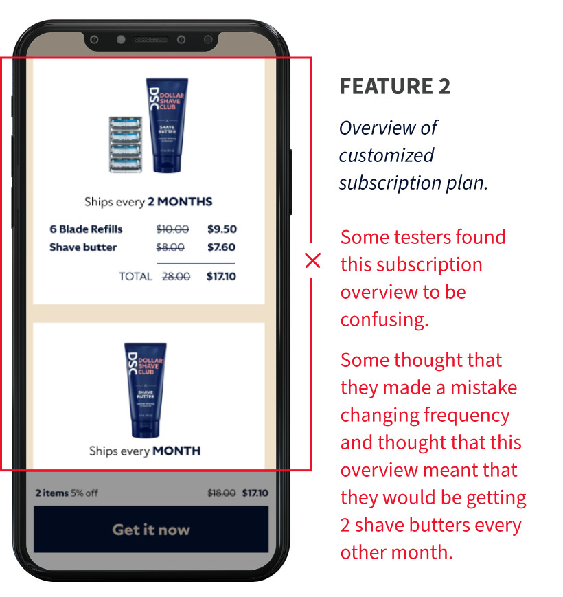
Testers found the overview of the subscription plan confusing
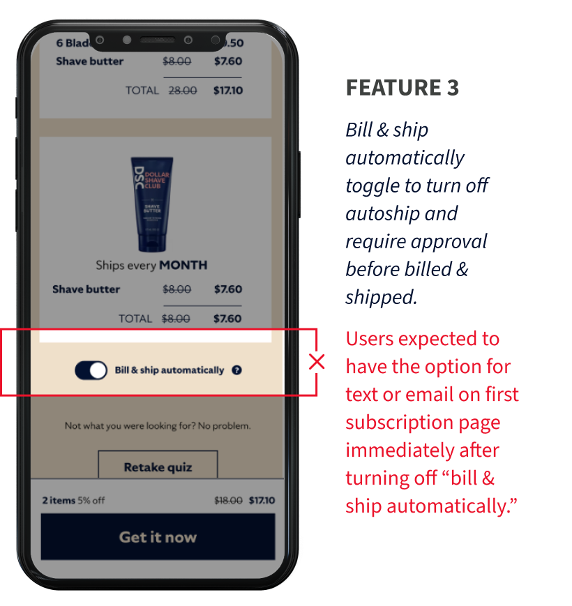
Users expected to have the option for text or email reminders on first page of subscription process
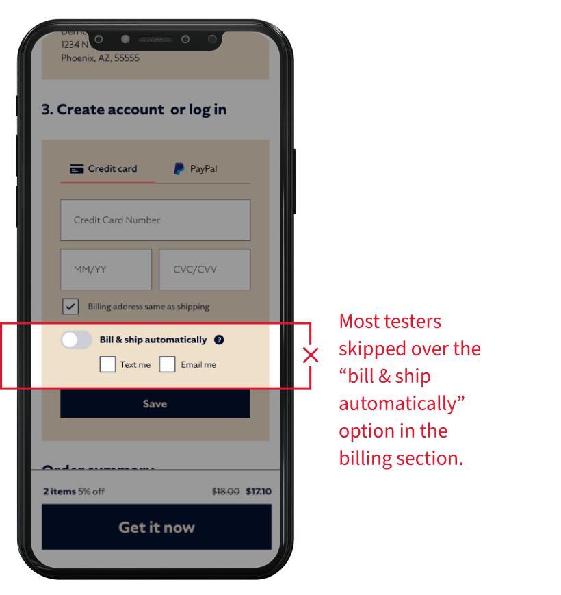
Many users skipped over “bill & ship automatically” option in the billing section
Some testers said it was not clear that without approval no shipment would be sent.
GAIN POINTS
Testers stated that they would find the customization feature useful and like having more control over their subscription
All testers completed the feature 1 task successfully
Some testers noted that they appreciated having a text confirmation instead of having to remember a password.
Iteration
Based on the feedback from user testing, I revised the screens in which I identified pain points.
The first iteration was made on the subscription management page, where I changed the breakdown of items from by box to month. This change was made in an effort make the subscription overview more understandable.
On the same screen, I also added the information about autoship options instead of hiding this information in the billing section.
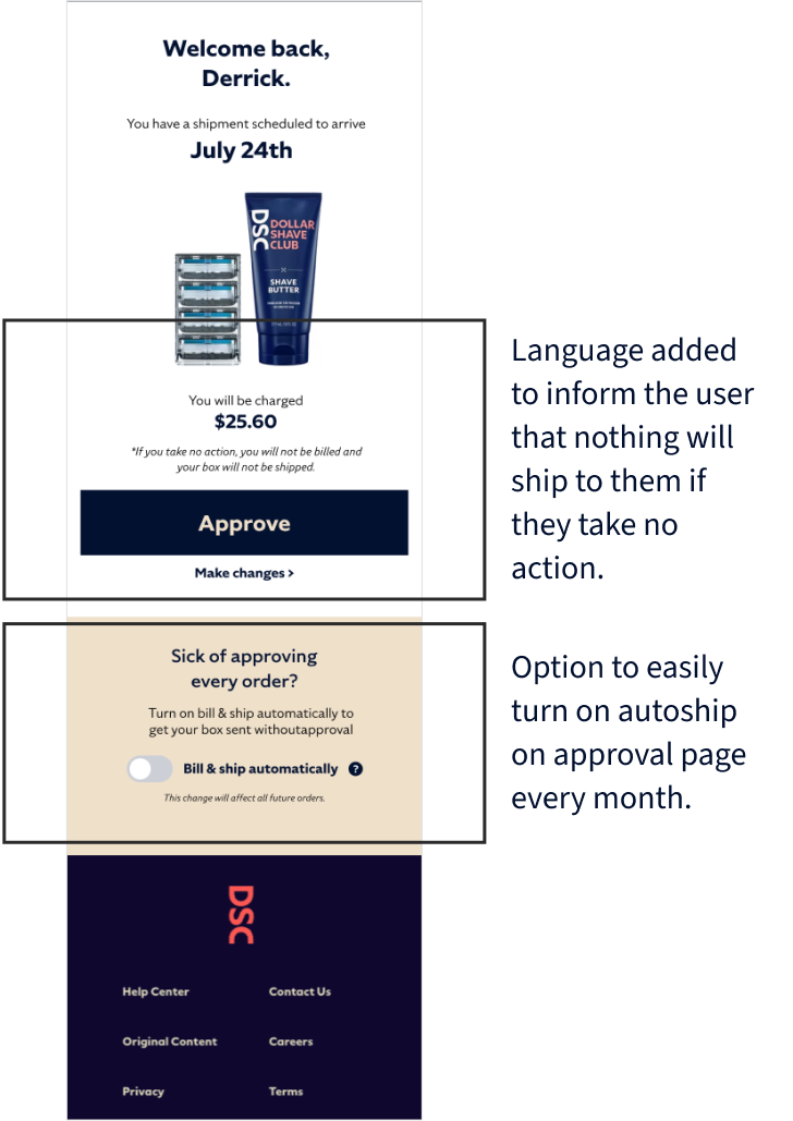
On the confirmation screen, I added language to inform the user that nothing will ship to them if they take no action.
I also added the option to easily toggle on autoship on the approval page every month.
“I’ve wasted so much money on unexpected boxes, so the approval option is really helpful and I would probably keep my subscription for longer.”
— User tester
Final thoughts
This was were the project ended, but given more time and resources, these would be my recommendations for next steps:
Test iterations
Conduct additional usability tests with updated prototype after iterations
Design & test desktop experience
Design and test the desktop subscription experience of the added features


